
I'm into old computers. More accurately, I'm into old software. The computers themselves -- while being pleasing objects -- take up space, and have components that rust and seize and leak and explode. Keeping the magic smoke inside the beige box is a constant battle.
Enter virtual machines and emulators. Many talented people have spent a lot of time making digital versions of hardware. This is vital for digital preservation; something which the original companies (if they still exist) seem to have no interest in. More germanely for our purposes, it lets us fool about with this old software.
In this instance I was playing around with Macintosh System 7.5.3 on Mini vMac, emulating a Macintosh II. I'm a big fan of the UI design of System 7 and System 8. It's taking advantage of colour displays, but it's still a light touch.
In the Apple menu there are a collection of applications (desktop accessories?). One caught my eye -- Stickies.

The reason is that I remembered that Stickies was an app ported to Rhapsody, Apple's initial steps at combining NeXTSTEP and the classic Macintosh operating system -- a direct predecessor to modern macOS and iOS.

Stickies is an application that is still shipped with macOS Sequoia, making it one of the few through lines from the older Macintosh operating system, and not NeXTSTEP.
For example, Modern Finder derives more from File Viewer than classic Finder. The dock is from NeXTSTEP. If we compare System 7.5 to Windows 3.1, Microsoft's contemporary operating system, System 7.5 feels far more disconnected from modern macOS than Windows does from its earlier versions.

This speaks to Microsoft and Apple's differing opinions on the value of backwards compatibility. Which is why finding an app like Stickies interested me. So how much of that original DNA remains?
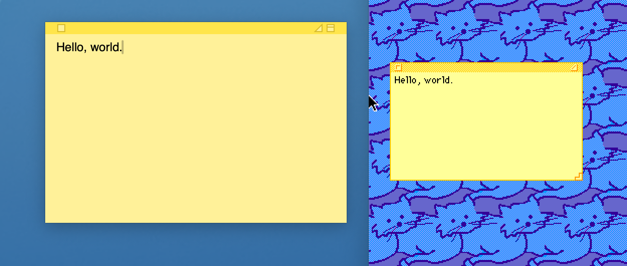
The square close button and general design are strikingly familiar. The macOS iteration has an extra button to roll up the note, and has done away with the resize affordance, instead changing the cursor to indicate you can resize the note.
They both have the triangle button, but they do different things. In the System 7 version, the triangle shrinks the note so that only the content is shown, a la the old OS X green plus button behaviour.
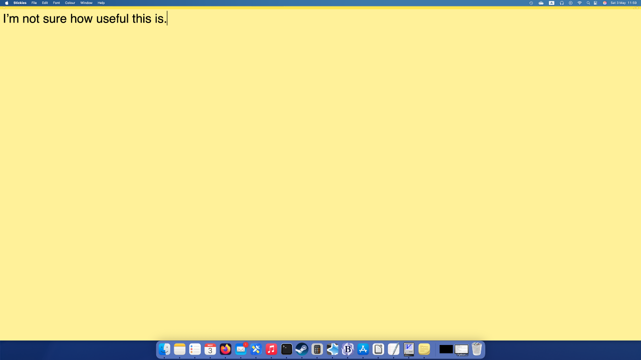
The triangle button on macOS instead makes the note take the entire screen. I'm not sure I would ever need a note to fill my 4K monitor, but the option is there.
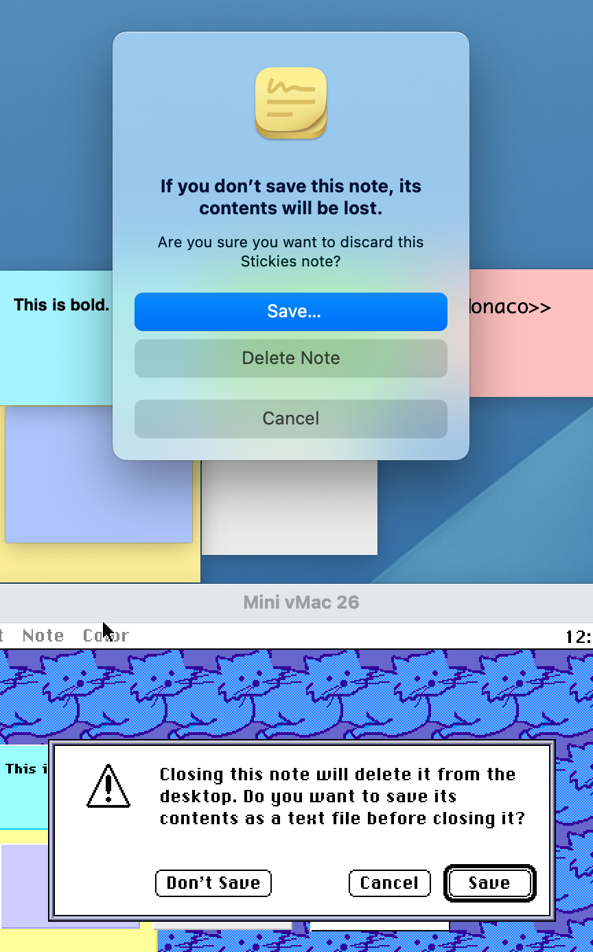
(The Rhapsody version of Stickies has the triangle behaviour of the System 7.5 original.)
Most of the colours are still present, with the exception of black and white.

The notes are much more primitive in the original version. The text style applies to the entire note -- you can't have a bold title, and normal text underneath. The modern stickies can have embedded images.
If this was interesting to you, see this post from the original author (Jens Alfke) about the origins of Stickies.